Wednesday 3 July 2019

Juice advertising


This advertisement is of a juice house in the city of mekelle. As you can see, they're letting all the pictures do the talking. The upper portion of the ad is obviously not their own picture. They took that down from the Internet. The pineapple is very dirty on the top, which is bad considering that it is a juice house. Sanitation is taken very seriously.


Speaking of sanitation, the bottom part is their own servings. As you can see on the left bottom part the juice on the edge looks like it's seen better days. It looks like it's been out for a while and it's overripe. That shouldn't even be served let alone be put up as an advertisement. It brings up the wrong image. It makes suspicions rise like "is that what is being served to me?" Or "that's disappointing."


Sometimes it's even "I better go to a better place." That is not the thoughts they want to put in the minds of their consumers. Not at all. The way it's put up, it has no thought put into it. It's beginning to get peeled off and the walls aren't doing it any favor too. It us extremely noticeable too. The name on the top part is plastered on. That's unprofessional.


While the "juice" part is typed in the banner the "mahider" part is plastered on. That makes it seem like there wasn't enough though put into it. They didn't put any details into it. The background color isn't matching up. There are three different types of background color and they all don't mash up together. Background is important. It attracts from even being beside it if done right but if done wrong, it's an irritation. You don't want to look a at it too long.


So what they should do is, they should first change up the background color into something that's softer to the eye but strong enough to attract it even from a side eye position. Then they should do the writing in a professional and well mannered color like dark grey or black. The background really depends on that though. They should also take down the bottom picture, do a better photo of their products and put that one up.

Tuesday 2 July 2019

EVE SANITARY PAD advertising mistake advertise by selam tesfay


Advertising  is the most important  to selling  product  and services  by using  different media, like  print, on line,, broadcast etc...  and in different media product or services  advertise by testimonial ,ordinary people  or famous artist to attract consumer attitude.


    I  criticize  eve sanitary pad advertising  in this  advertising found  both strong and weak side but  the mistake  of  the  advertising  is more  greater than  strong  side. However, the video showed  the beautiful city of HAWASSA and almost  all of  its qualities. the  pretty birds, the famous fish  fries that are mostly eaten there.  the  beautiful  lake  that surrounds  the city. The quality of the video  was splendid. The audio of the women was clear,famous and informational.


    but,The  video, 90% of it, has  nothing  to  do with  what the main  purpose  of  the video to begin with. The  information they gave about the product was false and  misinforming  according to research made from  most women. The clothing that the women ware was  absolutely wrong according to the  situation which  was a long white dress. The fact that  she was wearing that  riding abike was unrealistic and unconventional. in this  advertising  the whole video was mostly  about the city and, not about product.generally  this advertising  using exaggerated  words.

 
  finally  in my opinion  this advertising  correcting by  first  avoid  unnecessary  style to growth  strong side. The advertising focus on  product  advantage  but, not use exaggerated words.


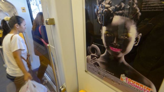
Dunkin' Donuts

Thai passengers walk past a Dunkin' Donuts advertising campaign featuring a woman with black face make-up displayed at a skytrain station in Bangkok on September 3, 2013

Image copyright
In the US and most of the West, this poster would have caused outrage and accusations of racism.
But in Thailand, an image of a woman in black face and bright pink lipstick to promote a new "charcoal donut" wasn't deemed a big deal.
The chief executive of the Thai franchise - whose daughter was the model - reportedly said at the time: "I don't get it. What's the big fuss? What if the product was white and I painted someone white, would that be racist?" But a spokesman for Dunkin' Brands apologized.
The use of black face - which historically was used by non-black performers to represent a black person - is still used in some Asian countries. Last year, a company in China used it to promote a laundry detergent.

Pepsi Runs a Disastrous Lottery

Here’s What Happened

Yes, Pepsi again. In 1993 in the Philippines, Pepsi ran a lottery, in which—if you found the bottle cap with the right code on it—you could win $40,000.
The problem? Pepsi announced the wrong code. So instead of 1 winning bottle cap, there were suddenly 800,000 winning bottle caps. Pepsi refused to pay; outrage ensued.
From marketingshmarketing.com.

Why It Missed the Mark

Do we even have to say it? False hope and botched lotteries are not good ways to do business.

Takeaways

If you’re going to run a lottery or contest or anything promising a big, life-changing reward, please make sure you’re running it carefully and 100% free of mistakes.

Monday 1 July 2019

የሲጋራ ማስታወቂያ


       ማስታወቂያ ህብረተሰቡ በምርት  ግብይት ወይም  በአገልግሎት  ረገድ  በሚያደርጋቸው  እንቅስቃሴዎች  ላይ  ተፅዕኖ  በማሳደር  ለሀገሪቱ  ኢኮኖሚያዊና  ፖለቲካዊ  እድገት  ከፍተኛ  ሚና  የሚጫወት በመሆኑ ሀገሪቱ  በገበያ መር  የኢኮኖሚ ስርአት የምትመራ ከመሆኑ አንፃር ገበያው  ጤናማ በሆነ  ውድድር   እንድትመራ በማድረግ  ረገድ ማስታወቂያ ከፍተኛ አስተዋፅኦ  የሚያደርግ በመሆኑ የማስታወቂያ  አሠራጮች  መብትና ግዴታቸውን በግልፅ  መወሠን በማስፈለጉ   በኢትዮጲያ ህገ መንግስት መሠረት የታወጁ  አዋጆች  አሉ።ቀጥሉም  ያለውን  የማስታወቂያ  ምስል  መተቸት አንችላለን።


        በሀገራችን  የማስተወቂያ  ህግ መሠረት  አንድ ማስታወቂያ  መተዋወቅ  ያለበት  ለህዝቡ  ጥቅም  የሚሠጥ እና   ለሀገር   ኢኮኖሚ  እድገት ይሆናል   ተብሎ  ከታሠበ   ብቻ ነው።  ነገር ግን  ይህንን ማስታወቂያ  ከዚህ  አንፃር  ስናየው  ጥቅም  የሌለው ማስታወቂያ ነው።  ሌላ ደግሞ  በኢትዮጲያ  የማስታወቂያ  ህግ  መሠረት  የሲጋራ  ወይም  የሌሎች አደንዛዥ  ዕፆች  ማስታወቂያዎች የያዘ  ማስታወቂያ  የተከለከለ ነው።
     

ስለዚህ በዚህ ህግ መሠረት  ይህ  ማስታወቂያ  በእኛ ሀገር ሙሉ በሙሉ የተከለከለ እና  አስቀያሚ ማስታወቂያ ነው። ሌላው ደግሞ ይህንን ማስታወቂያ  ከሀገራችን  የማስታወቂያ  ይዘት እና  አቀራረብ  አንፃር  ስናየው  ለምሳሌ  ወንዱ ሴቷ ላይ የሲጋራ  ጭስ በፊቷ ላይ  ሲያለብሳት ይታያል።ይህም ማለት የእርሷን  ስብዕና እየተጋፍት አናያለን። ከዚህ በተጨማሪም  ደግሞ  ሴቷ   በሲጋራ  ሱስ የመያዝ  እድሏ ከፍተኛ  ነው።  በአጠቃላይ ይህ  ማስታወቂያ   በውጮች የአለም ክፍላት  ጥሩ  አስመስለው  ቢያስተዋውቁትም  እንኳ  በእኛ ሀገረ  ግን  የተከለከለና  የተወገዘ ነው።


      በመጨረሻም  የመፍትሔ  ሀሣብ  ሊሆን  የሚችለው   የአደንዛዥ እፅ  ማስታወቂያ  የሚሠሩ  ሠዎችን ማውገዝና  ቅጣት መቀበልም  አለባቸው።  በተጨማሪ  ደግሞ  ምርቱ አንዲጠፋ  ማድረግ  መቻል ነው። ሌላ  ደግሞ ማስታወቂያው በጭራሽ መሠራት የለበትም።   ማህበረሠቡን  ይህ ምርት  ጎጂ  እንደሆነ  ግንዛቤ  ማስጨበጥ   አለብን።


This advertisement board is found in mekelle city in one of the many neighborhoods. It is a traditional medicine spot which reads "well known traditional medicine in Gonder and Gojam." That's the paraphrased version of it. As you can see, it is very wide and has a lot of writings under the main writing which is at the top. A lot of pictures of the herbs and medicines they provide.


The small writings are very small and very hard to read. Especially to the people who just pass by. The advertisement board is meant to catch the eyes of the public, not to make them feel like they're reading an article in a newspaper. That is not the purpose of ANY advertisement board. Sure, they're listing out all their services, but it is preferred that they only list out the main and top services.


The other thing is, the ad board is very long. It is supposed to be kept simple, not long. What's the use of the ad if the public doesn't WANT to read it? If it's too long, it becomes work. Making it boring since they wouldn't have the time for reading all of that. The writing underneath the list of services along with the phone numbers is done very wrongly. It's all mused up together and you have to really focus go read it right.


The phone numbers alone, need spaces between then not just the slash sign. That's mixed up in them too. The writings before the phone numbers need a bit of some focus to read too. I had to read very slowly to understand what they said clearly. Again, it's too mused up together. Takes time to read it. So what they have to improve is, the sign has to decrease it's size and width in the first place.


The small writings of the services should be decreased to the main services and the main herbs. They should be one of the only ones written. It makes the board easy to read and definitely not boring. The other thing is the writings on the top and bottom should have spaces between them, eliminating having to put in that much effort and focus to read it. The color choice should also catch the eye because the current color is a neutral color, mostly.

የቃና ፕሮግራም ማስታወቂያ


የkana tv logo ምስል ውጤት


ቃና ቴሌቪዥን  በሀገራችን  ከተጀመረ  አራት  አመታትን አስቆጥሯል።ታድያ  ይህ  ስርጭት  በሃገራችን መጀመሩ ብዙ  የኢትዮጲያ ዜጎች  ለፕሮግራሙ ያላቸው  ፍቅር  ከፍተኛ ነው። ታዳያ ተመልካቾች  ምን  አይነት ጫና እየደረሠባቸው መሆኑንም ማወቅ ተገቢ ነው።

ከላይ ያለውን  ምስል በማየት ለተመልካች  ምን ያክል ጫና አንደሚያደርስ  መገመት አይከብድም።ይህ ምስል እንደምታዩት  "ቃና   ውስጤ  ነው" የሚለው  የቃና ቴሌቭዥን  መፎክር  የብዙዎቸን  ትኩረት  የሳበ  ፅሁፍ  ነው። ይህም  ማለት ብዙ ሰዎች  ለቃና ፕሮግራም  ያላቸው  ፍቅር  በጣም  ውስጣቸውን ሠርስሮ  ሠርፆባቸዋል። ሰዎችም ኧረ  ቃና ፕሮግራም  ወስጤ ነው አንድም ፕሮግራም አንዲያልፈኝ  አልፈልግም እያሉ  ሙሉ ጊዜያቸው  ያጠፍሉ። መስራት እያለባቸው  ሳይሠሩ  ይቀራሉ።

ሌላ ደግሞ  የሚነበቡ መፅሄት፣መፅሀፍት መከታተልና ማንበብ  ትተው  ኧረ እኔ ቃናን ነው መከታተል  እምፈልገው  ቃና እኮ ውስጤ  ነው እያሉ  እሚሸወዱ  ሰዎች  ቁጥራቸው በሃገራችን  እየበዛ መጥቷል። ሌላ ደግሞ  በአለባበስ   ብንመለከት  አብዝሀኛዎቹ  የሀገራችን ሴቶች  ቀሚስ ከመልበስ  ወደ ሱሪ፣ አጫጭር  ቀሚሶች፣ቁምጣ መልበስ የሄዱት  ይህንን  ፕሮግራም በመከታተል ነው። የእኛ  ባህል በተለይም ሴቶች  ቀሚስ  መልበስ እንጅ ሱሪ መልበስ  አይደለም።

ሌላው  በአመጋገብ   ብናይ  እኛ   ኢትዮጲያኖች  በአንድ  ተሰብስበን  በአንድነት መመገብ ነበር ባህላችን   በአሁኑ  ጊዜ  ግን  ሙሉ በሙሉ  ባይጠፋም  ነገር ግን  በመጥፍት  ሂደት ላይ  ነው።  ይህም  የመጣው አሁንም  የውጮችን  ፕሮግራም  በመከታተላችን ነው። በመጨረሻም  ማስተላለፍ  የምፈልገው  ነገር  ቢኖር  ራሳችንን ባህልና  ወግ፣ልማድ በውጮች  ባህል  መቀየር  የለብንም።